Tag: visualization
-
Campaign computing
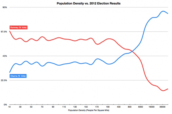
I guess it’s a little anticlimatic to be writing about the US presidential election now, but…
-
Displaying data
In a post some time ago, I wrote about my growing interest in data visualization, and…
-
End-user or business stakeholder?
[This is a modified version of a post I made internally on SAP’s Lean Transformation blog. …
You must be logged in to post a comment.